It takes 1/5 of a second for someone to form an impression of your site. In another 2.6 seconds, they will have located the content that interests them.
In that time span of 2.8 seconds the user has scanned the page, made some judgments, and is ready to move deeper into your site.
Or move on in search of a better site.
Our point: Every aspect of content placement on a home page or landing page has to be scrutinized because even the smallest decisions can affect performance.
So let’s take a look at exactly what’s happening in those 2.8 seconds and talk about a few of the essentials of eyeflow.
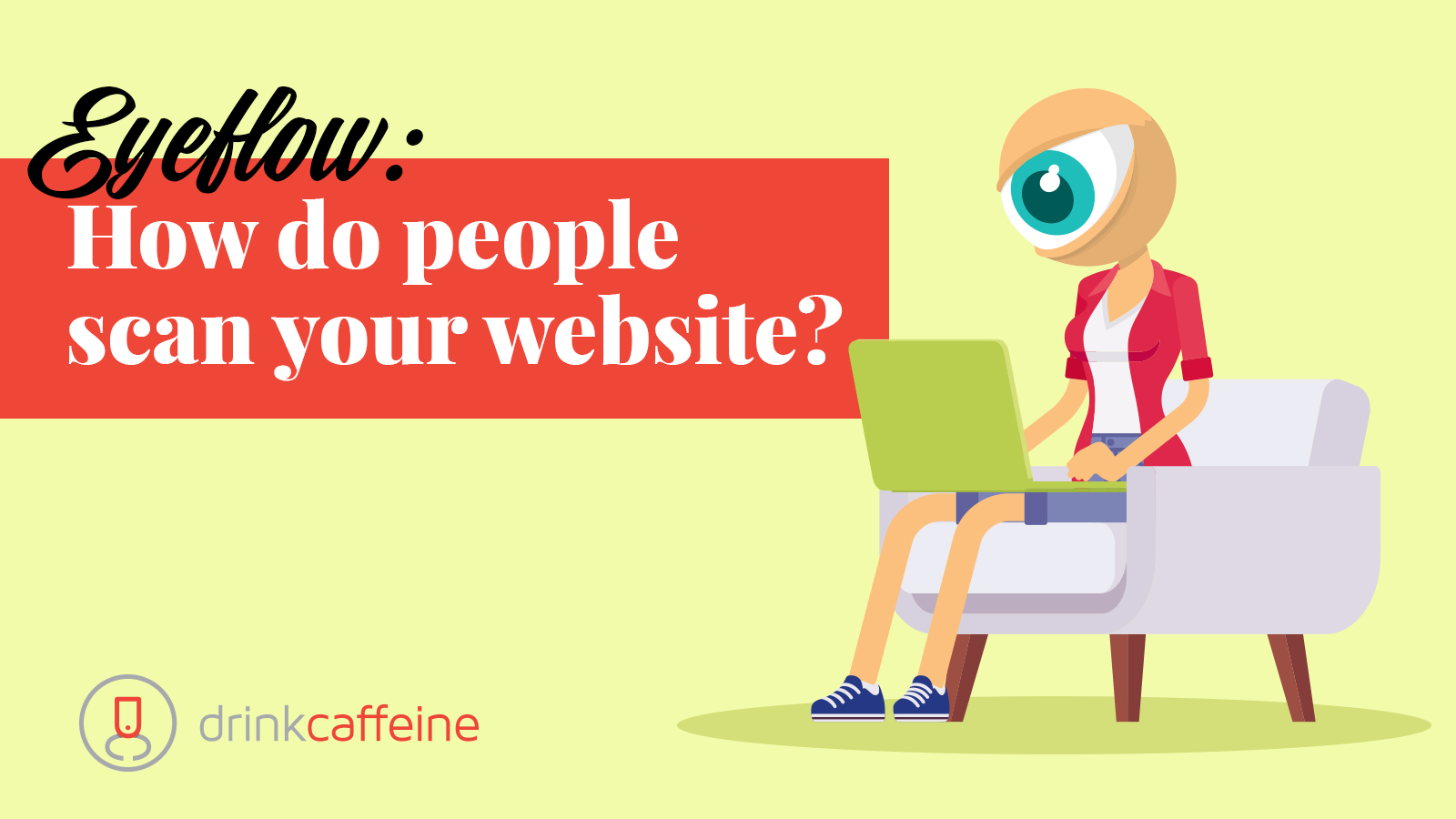
1. Scanning vs Reading
Scanning a page – as opposed to reading it – is how people seek content. Jakob Nielsen pointed out many years ago why we scan rather than read but the dominant reason is twofold: Time pressures, and the fact that reading a computer screen is tiring to the eyes.
When scanning, the eye generally makes short, rapid eye movements as it moves across a web page, seeking the touchstones and visual cues that signal the content environment is relevant and useful.
2. From Gutenberg’s “Z” to Nielsen’s “F”
Gutenberg’s diagram is the basis for how we are taught to enter a web page visually.
Our eye tends to move in a “Z” shaped pattern, starting in the upper left corner – because that’s how we read – and moving right, left, and right. [This explains why, in print advertising, the logo is often positioned lower right.]
But our exposure to the web – and especially to search pages – has reshaped our eyeflow into the form of an “F.”
As you’d expect from the shape of the “F,” – as opposed to a “Z” – the eye tends to look across the screen twice and then stop, rather than completing the scan in the lower right corner.
Nielsen pointed this out in 2006 – viewers often start in the upper left corner and go right. Then they come back and follow a second movement, also left to right. Then they return to the left side and scan vertically.
Side point: Viewer eyeflow can change based on needs. General browsing eye patterns are slower, and more random than information-seeking patterns, which tend to be quicker and centered on navigation. Search page eyeflow tends to have a “hot potato” effect. If you’re redesigning a site, usability testing can provide clarity around how your content is being scanned.
3. Type hierarchy matters. Big Time.
Viewers look for and read headlines as an instinctive process for locating the main message of a page.
Subheads tend to be scanned as viewers go deeper into subpages, looking for relevant content – so don’t write meaningless subheads.
Make sure each subhead actually encapsulates the written content below it. This builds reader trust. And keep your fonts simple and consistent so readers begin to feel confident in the aesthetics and standards of the site.
4. White space
Clients tend to overfill web pages, forgetting that unoccupied space creates a sense of calmness, focus, and makes reading and visual digestion easier.
We advise clients to think of white space not just in terms of large areas, but also in terms of column spacing, leaving room around graphics, and even in terms of paragraph length. Short, one and two-sentence paragraphs surrounded by white space accelerate the read and make viewers feel they are getting somewhere.
The elements of commanding attention and directing viewers’ eyeballs to where they need to go is a big topic.
Too big, in fact, for a blog.
But if you want to get into it deeper, we suggest you stop by for a beverage.