5 Ways to Upgrade Your Healthcare Images
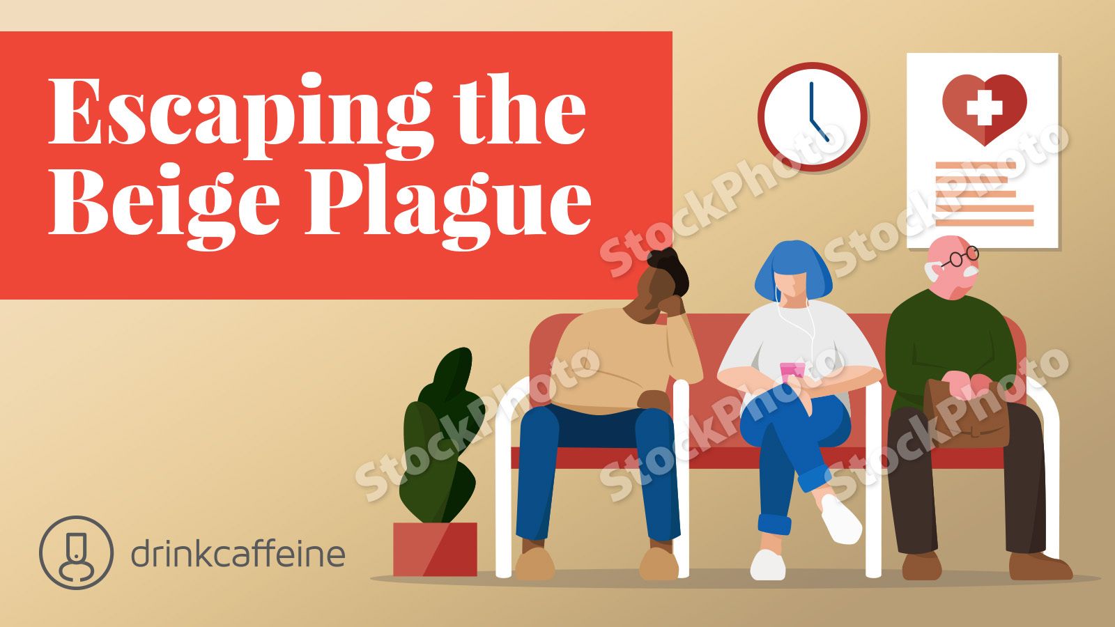
Marketers are often stuck with a healthcare photography library dominated by drab exam-rooms, painfully cheesy staff photos, and stock images with all the visual stopping power of shirt cardboard.


Here are 5 quick ways out of the putty-colored forest of healthcare photography.
1. Know the HIPAA restrictions. Of course you cannot show actual patients or reveal their PHI in any way – unless they agree to their image being used. HIPAA restricts many types of usage – but not all. Be sure to know the parameters.
2. Invest in original images. Yes, royalty-free stock images can save money, but they often feel worn out. And while rights-managed stock images are sometimes better, they can accrue charges that make a photo shoot start to seem reasonable. When you commit to 1-2 days of work with a professional, remember to shoot: Summer-season landscapes. “Team” photos. Candid and casual staff interactions. Medium close-ups of visual signatures such as signage and building exteriors and other outdoor settings. Also, images from around the community to show your sense of place.
3. Focus on emotions. Remember that healthcare is stressful and frightening for many patients. Showing stock images of patients in comfortable settings, relaxed and secure, takes a step in the right direction. Close-ups and body language can communicate a lot. Don’t feel like every image has to show someone smiling; serious expressions show you understand what’s at stake.
4. Emphasize blues and greens. Many healthcare organizations go for a clean, clinical color palate on their websites and other marketing materials, and that’s all good. But there are reasons why blue and green are the world’s #1 and #2 colors. They feel natural and calm – especially in mid-density and deeper color saturation.
5. Think outside of stock. There are other ways to support healthcare marketing content. Consider stock illustrations, information graphics, charts, and icons to keep the visual vocabulary feeling fresh.


