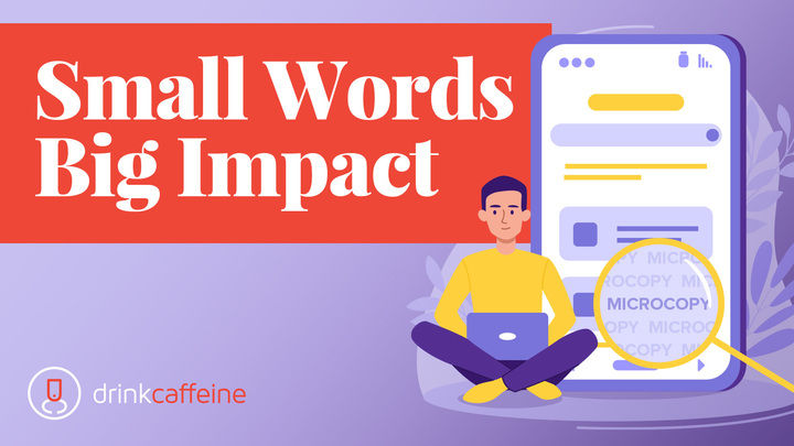
Something happens to consumers when a website asks them for something, whether it’s payment, personal information, or anything of value.
Typically, people pump the brakes. Example: Online shopping cart abandonment is nearly 70%.
The point: Requiring a visitor to share their email address, create an account or password, enter a credit card number, or subscribe to an e-newsletter is essential to conversion, but it’s like placing speed bumps on the consumer’s path to task completion.
This is where microcopy can make a big difference in conversion rates.
Microcopy – the short-form copy that appears on button labels, tooltips, shipping instructions, error, and confirmation messages, data entry fields, and so forth – can be a small but significant catalyst in how your website moves visitors forward to complete a task.
Here are a few fundamentals based on our experience.
5 microcopy fundamentals
1. Length
It may seem obvious but we’ll say it anyway: There’s no substitute for concision.
Our favorite example was from a note-taking app which, on its Create an Account page, positioned this microcopy beneath its email data-entry field: Never shared, never spammed.
Four simple words equated to a double-digit increase in account creation. Right message, right place, right time. And the right length.
2. Know thy audience.
Guiding visitors deeper into your site with microcopy requires an intimate awareness of their mindset.
For example, an education site we created years ago featured rich, long-format content experiences because the primary users were well-credentialed academics. Long articles were synopsized on the home page. Which line of microcopy do you think was a more successful call to action?
Option 1
Read more
Option 2
Read the full article
Option B beats the pants off Option A. Why? Because the audience was academicians who prided themselves on their intellectual curiosity and stamina. Yes, Option A is shorter, but Option B spoke the right words to the right user group.
Remember, there are lots of ways to understand the subtleties of your site visitors:
- Study site analytics (including heat maps) for data that shows where their interests lie and what pain points they are experiencing.
- Stay current with keyword usage that may reveal expectations visitors have when they arrive.
- Test messaging on landing pages to understand particular sentiments and sensibilities users have (more on this).
3. Keep it conversational
Marketers sometimes default to the formality of business-speak. It’s generally a mistake to do this in microcopy.
Better to keep it conversational. Jargon and technical system details (like error codes) tend to alienate the human beings using your site. For example, which of these options feels friendlier?
Stand by for authentication
Or
Give us a few seconds
4. Teasing can work wonders
True story: A large Physical Therapy practice offered quality webinars to PTs. The webinars had great attendance for years. Then, gradually, enrollment declined.
There was lots of creative and message testing that led to lots of landing page versions, but all the findings were inconclusive or ineffective.
Then user research unearthed this nugget: PTs had “webinar fatigue.” They had seen so many that they grew insensitive to the value of the experience.
So the webinar producers shifted content strategy. They pinpointed the most valuable parts of the presentations and featured a link on the signup page that went to sample slides. The link was supported with microcopy that said:
Get a sneak peak
before you sign up
Once visitors had previewed the content of the webinar they were informed and convinced of its value. This boosted signups back to earlier performance levels.
5. Testing
Testing is a big topic. For now we’ll confine the context to fast, focused methods of measuring simple microcopy statements.
- We recommend testing microcopy once basic site design is established and analytics have guided you to the problem zones where users are abandoning tasks.
- You can then test iterations of key conversion pages with A/B microcopy samples in place. Be wary of testing for too many variants at once, especially if you expect statistical sampling to be less than a 95% confidence level (300 completed tests).
- Your test should be based on a hypothesis that is educated and testable. We use a simple If/Then format. “If the conversion page is supported by microcopy that assures the user of confidentiality versus simply calling for action, conversion will rise.”
- Set a targeted number of desired samples, then let it bake, as they say.
When you’re ready to use evidence-based practices to solve marketing communications problems, contact us!


