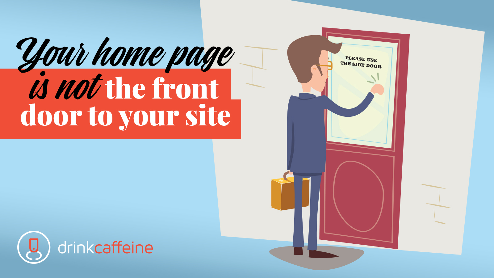
Who’s there?
Someone entering your website.
Someone entering my website who?
Someone entering your website doesn’t use the home page.
It’s no joke.
While many marketers still think of their home page as the front door to their site (and, perhaps, the foyer), in reality visitors are getting more and more accustomed to entering sites through other access points.
In other words, entry pages or “landing pages” as they are referred to in Google Analytics.
Landing page proof from Google
This Google Analytics report is a one-month report of landing page activity for a ski-resort client of ours.

The 30-day look-back means the results aren’t skewed to a single day of the week, and what does it show?
Only 35% of visitors entered the site via the home page. And that’s a good thing. By creating multiple, interest-specific landing pages, we open more doors to more people and connect them with the content they want.
Land your message
Too often, companies obsess about getting key messaging points and critical calls to action onto their home page – at the expense of defining message delivery by the needs of the user.
Landing pages are popular because they increase conversion rates. Conversion rates are increased because landing page content (when it’s done well) is tailored to the exact mindset of the consumer.
So rather than think of your site as a novella, consider it more of a magazine, with many different topics and offers that anyone can access as they wish. [To extend the analogy, landing pages are like those subscription cards that fall out of the magazine, only they actually get looked at and acted upon because the reader has chosen to engage them.
Thoughts & actions
- Map out your customers’ journeys. Know how they are getting to your website (search engine, email marketing campaigns, PPC, ad campaigns, etc.) and what level of awareness and sophistication they have based on the start of their journey.
- Identify what they need to know. Position this content front and center. Be equally clear on what you want them to do once they arrive on an appropriate landing page. Many times retailers move to close the sale on a landing page when further consumer education is what’s needed.
- Don’t forget microcopy. Microcopy – small, guiding phrases on screen that keep the visitor on track – can impact conversion significantly. “Never spammed, never shared,” under the data fired asking for an email address is known to boost action.
- Build a page design that supports the knowledge and expectations of the audience, and equip it with information architecture that 1. Speaks to their needs and 2. Aligns with your goals for the page.
- Monitor your pages. Then optimize the information presentation based on results.
Effective landing page is both art and science. If you’re interested, contact us for a conversation and a beverage.


